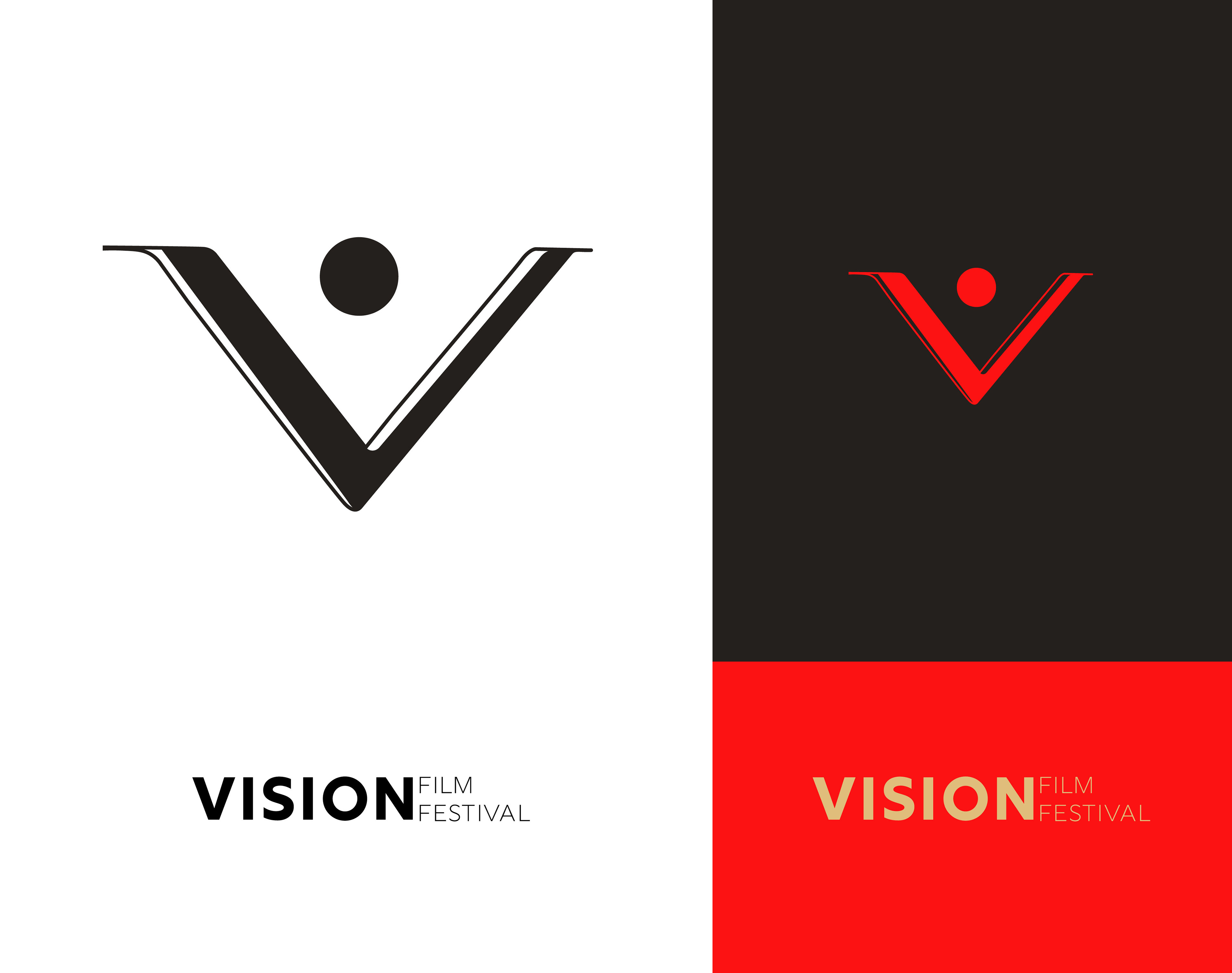
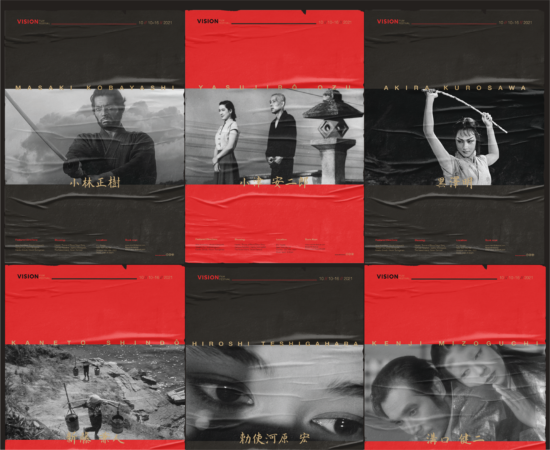
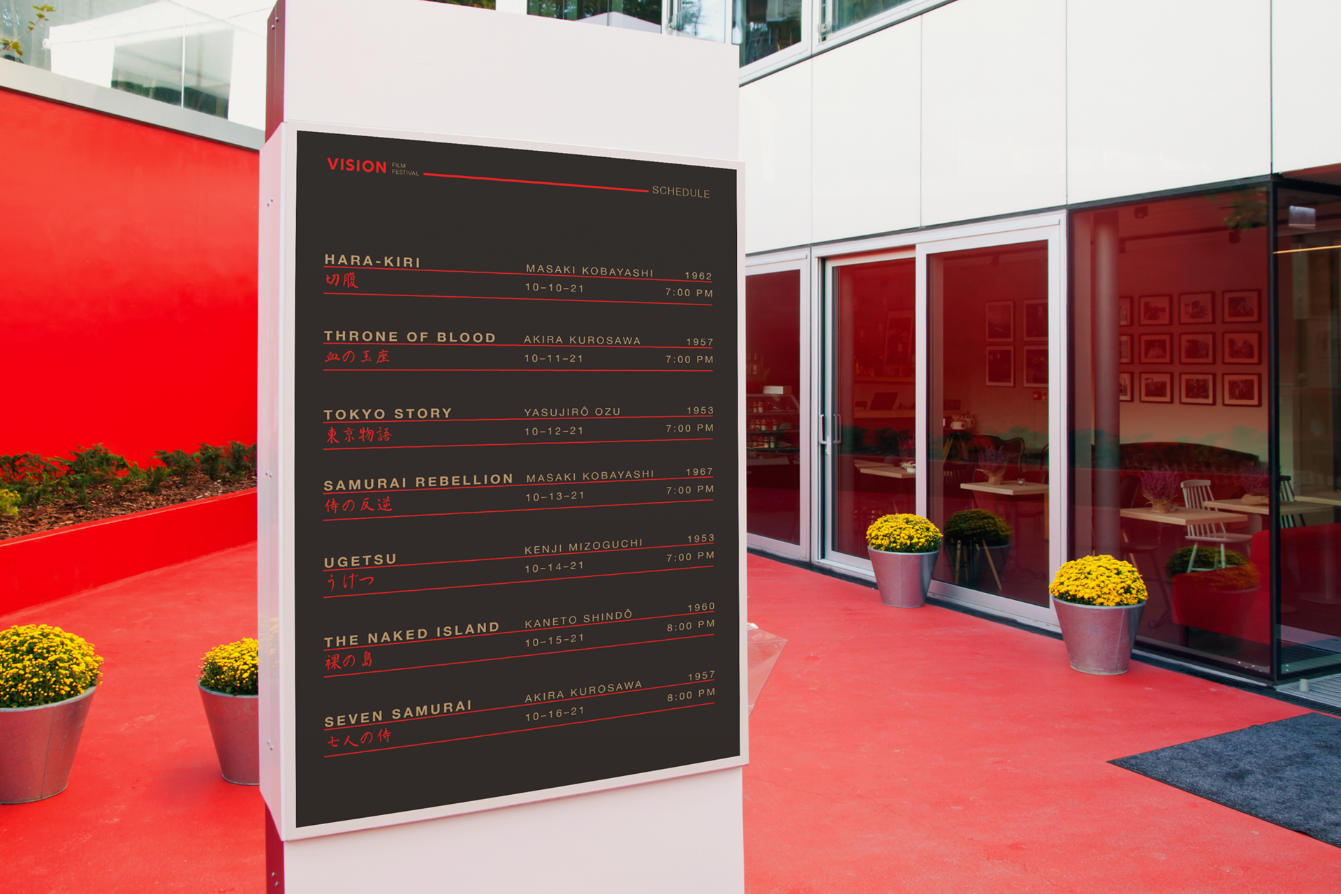
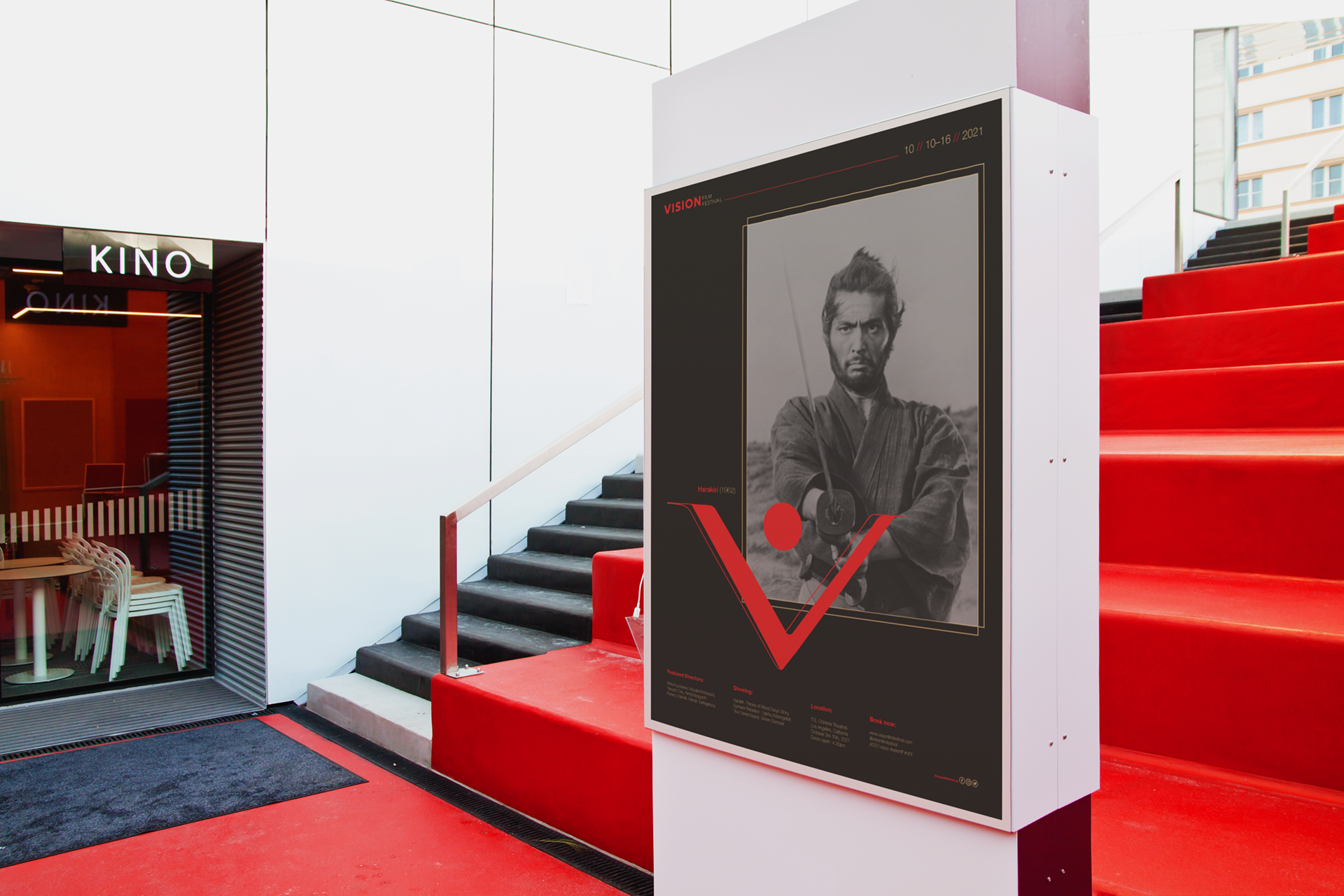
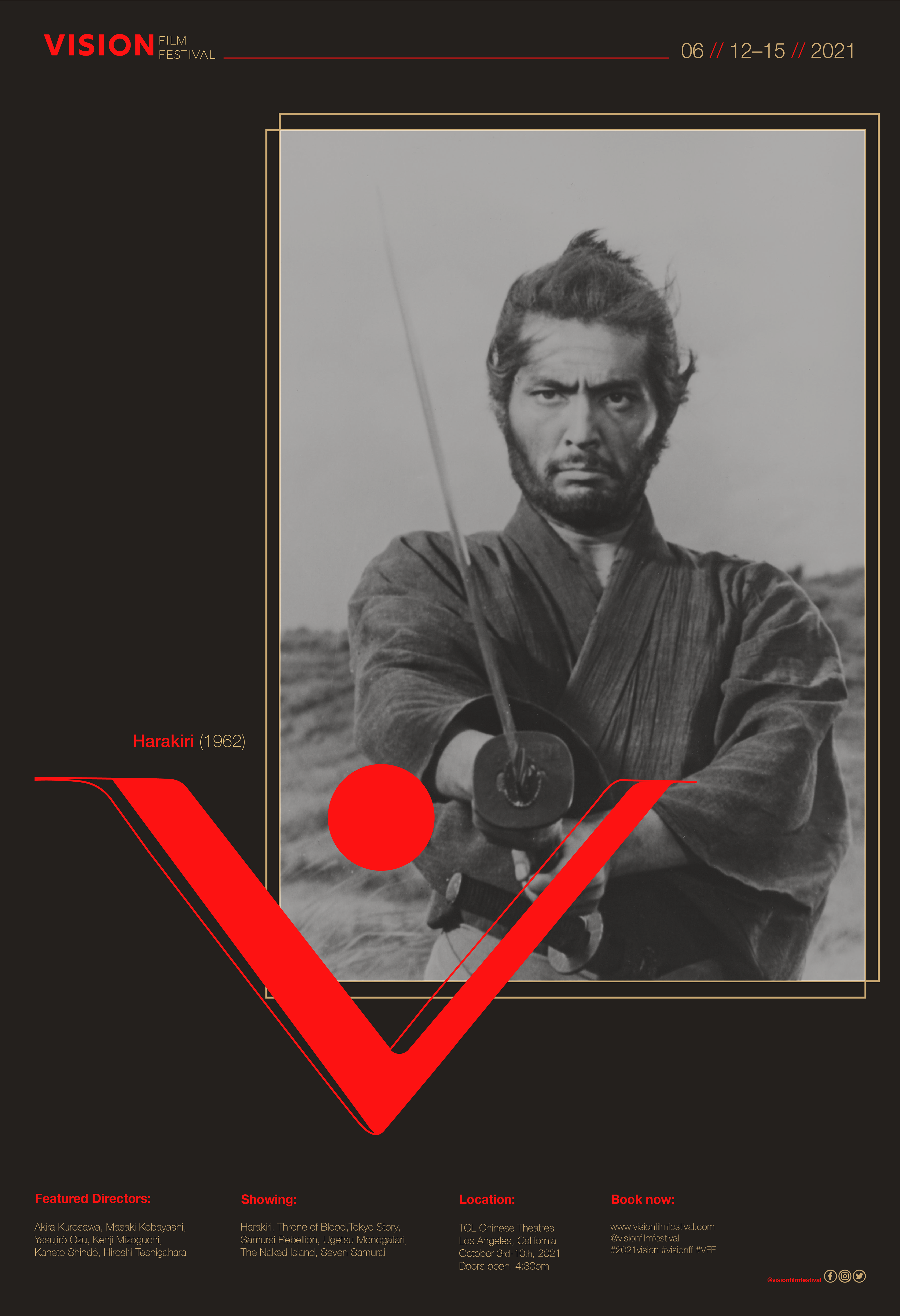
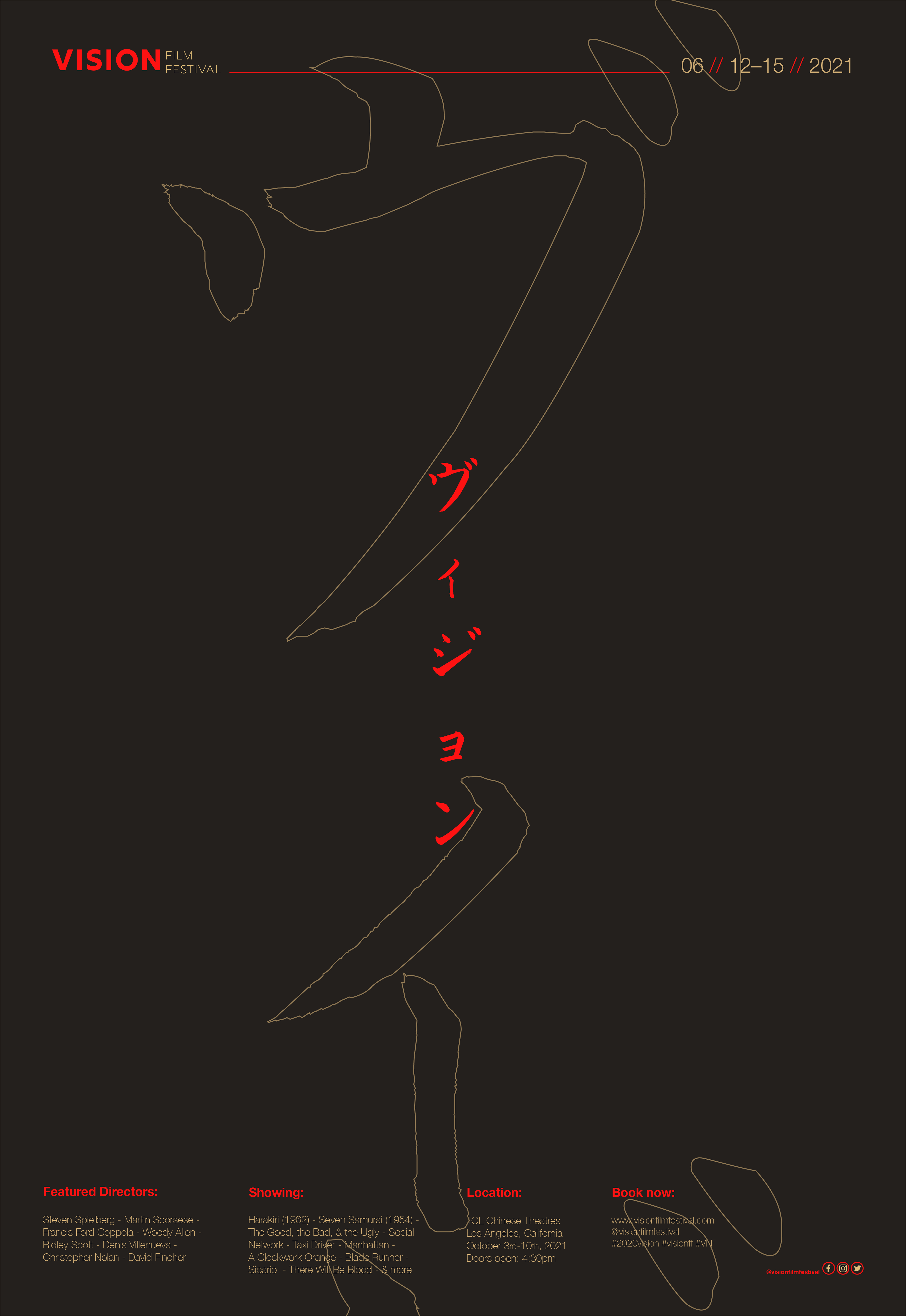
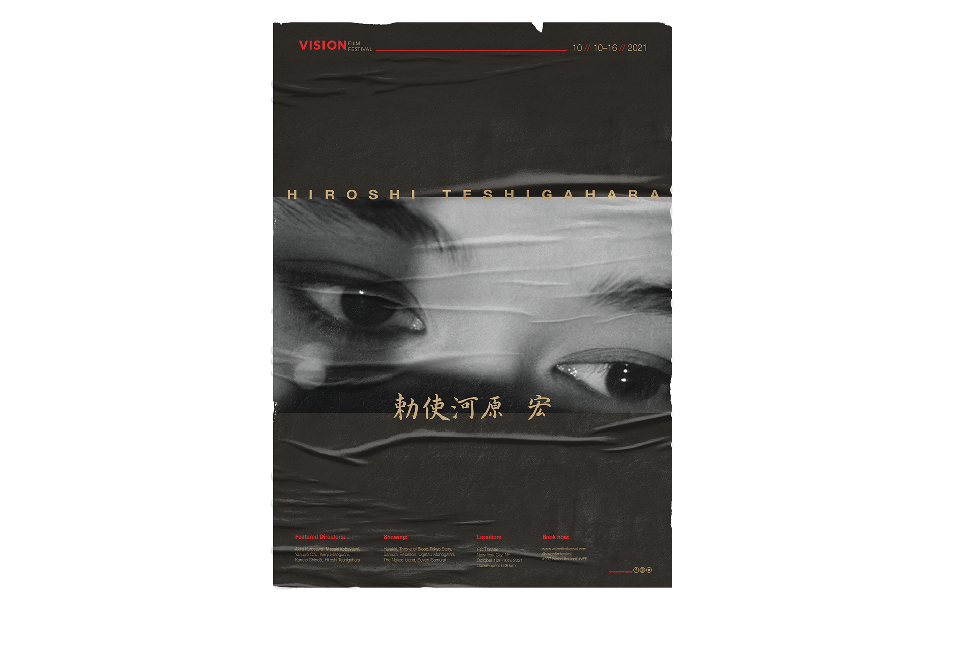
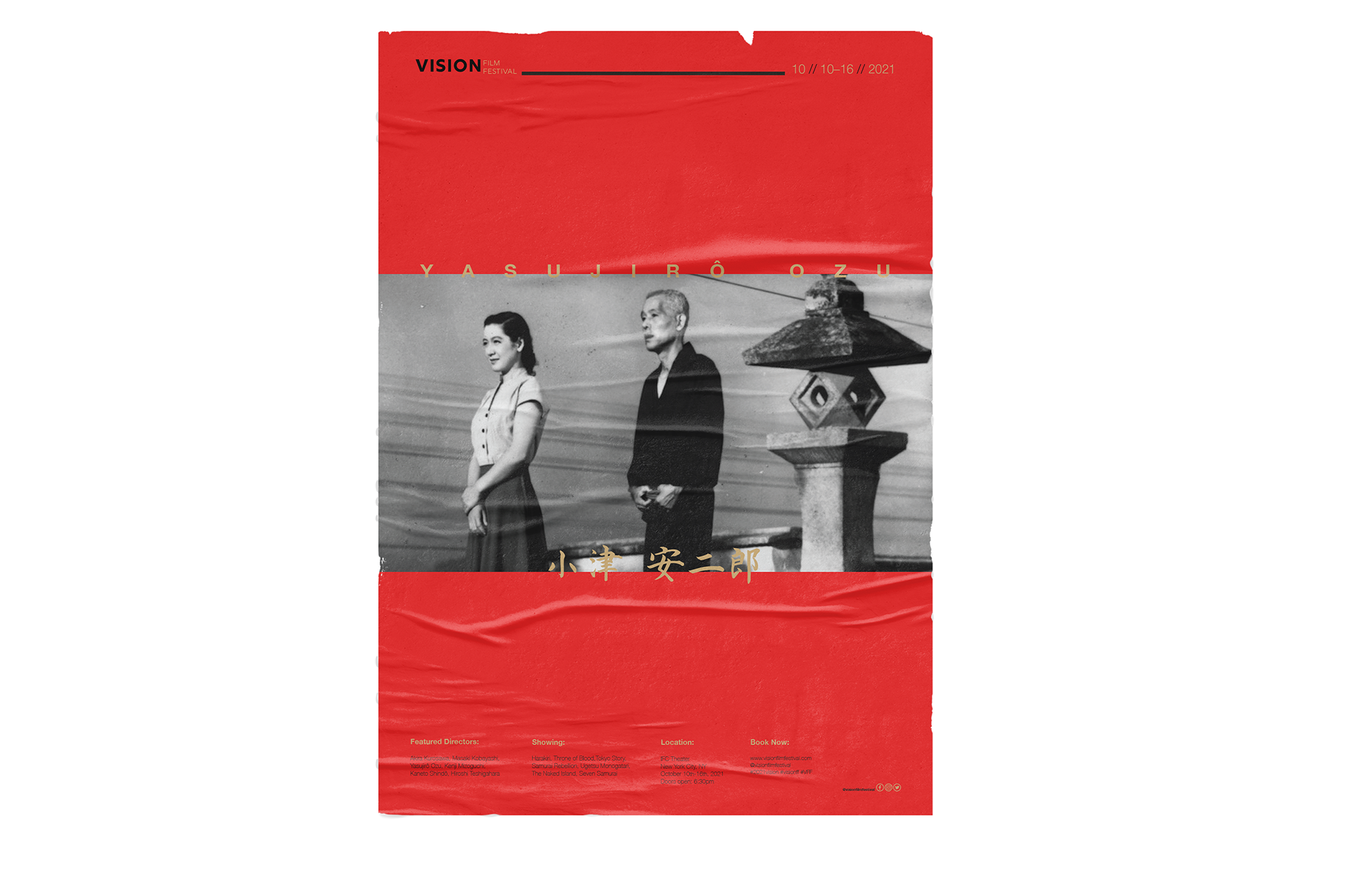
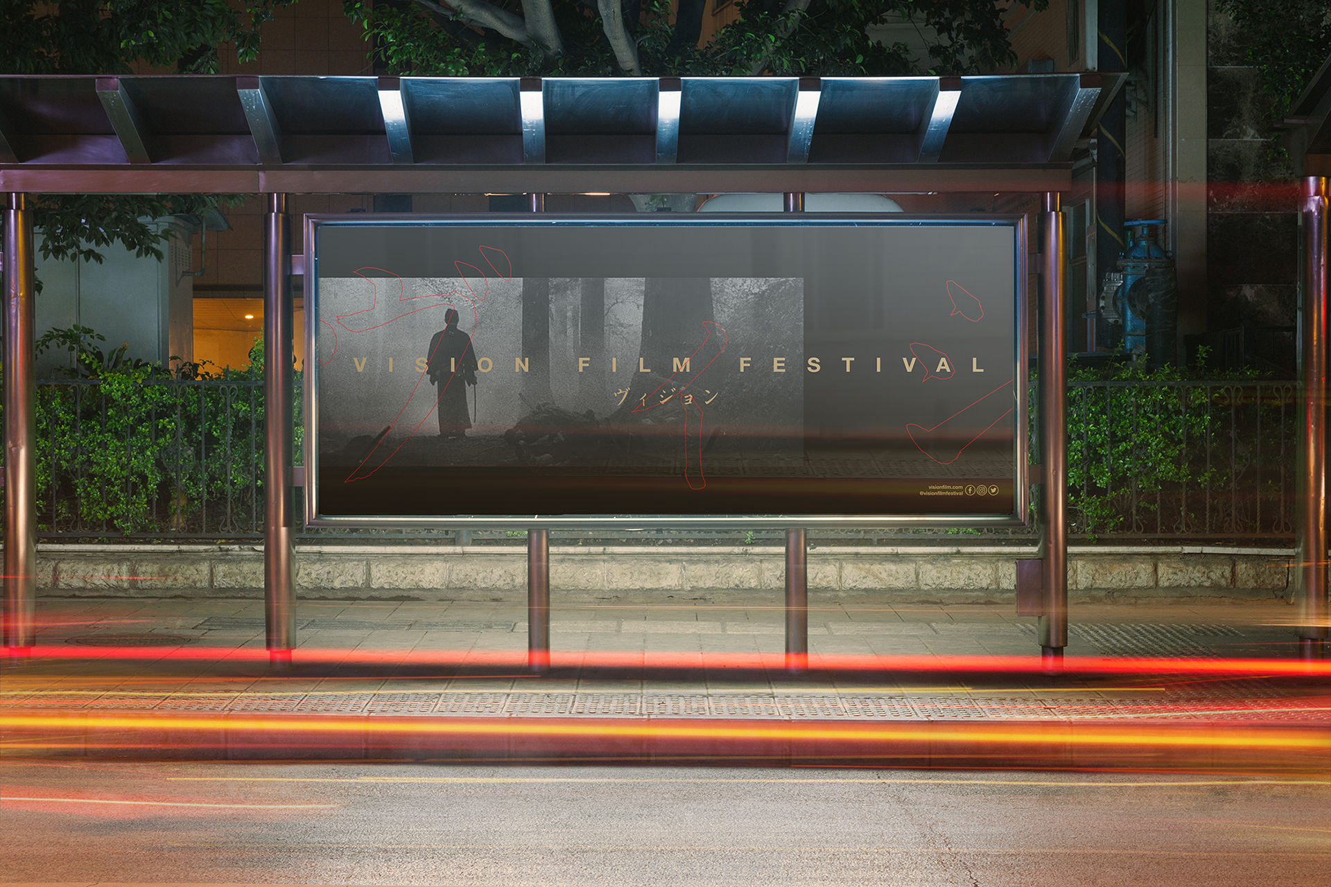
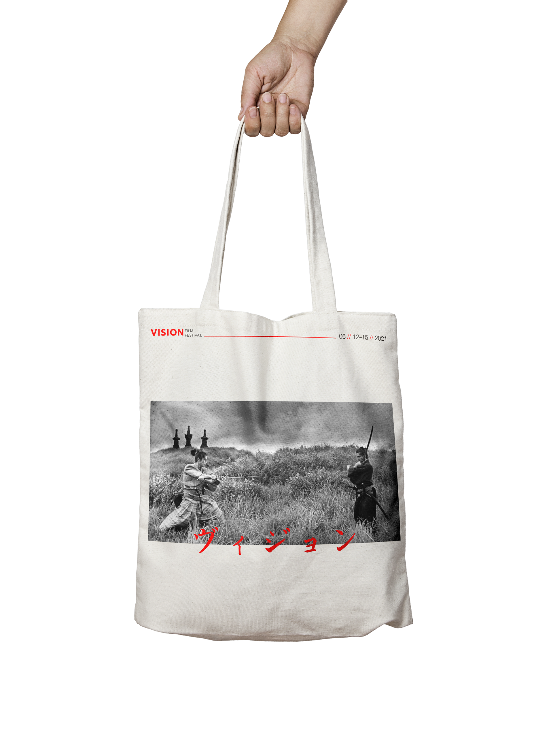
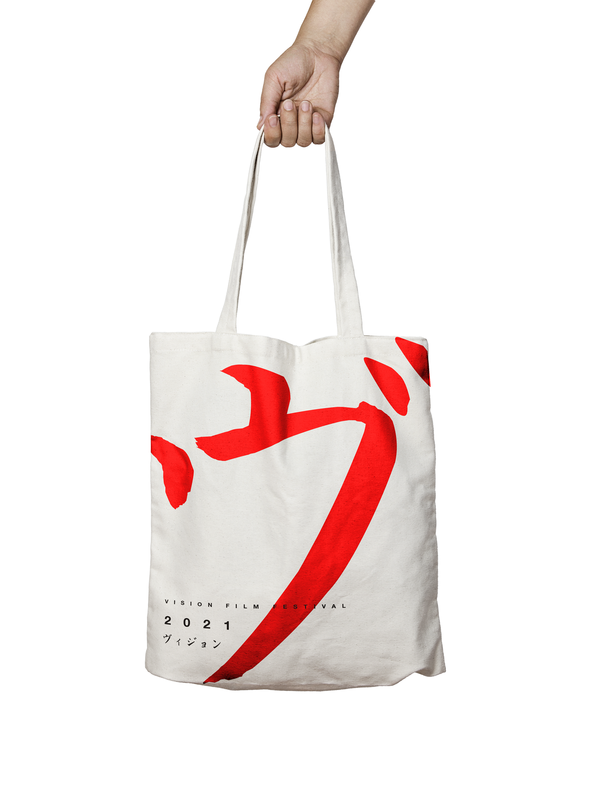
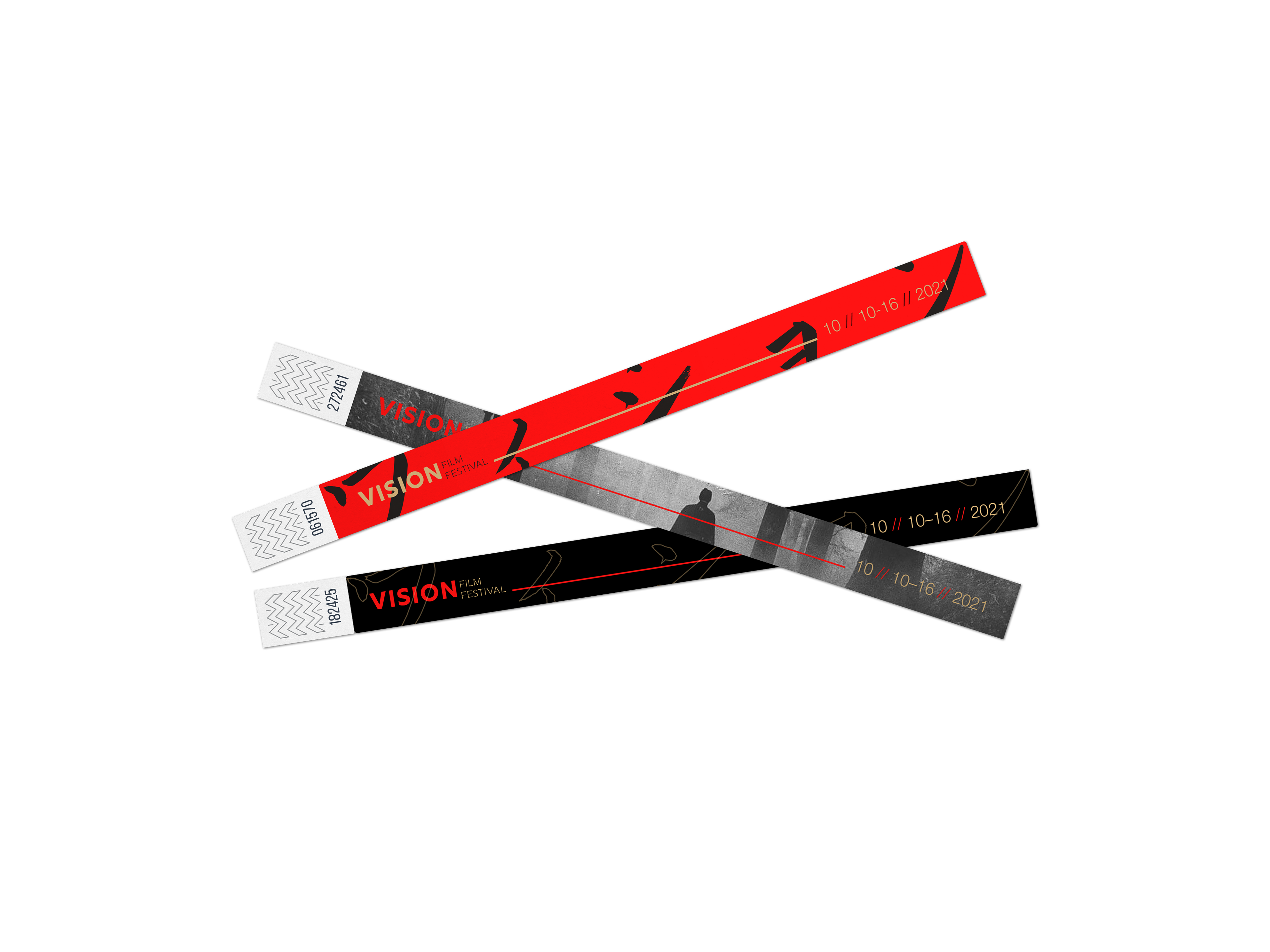
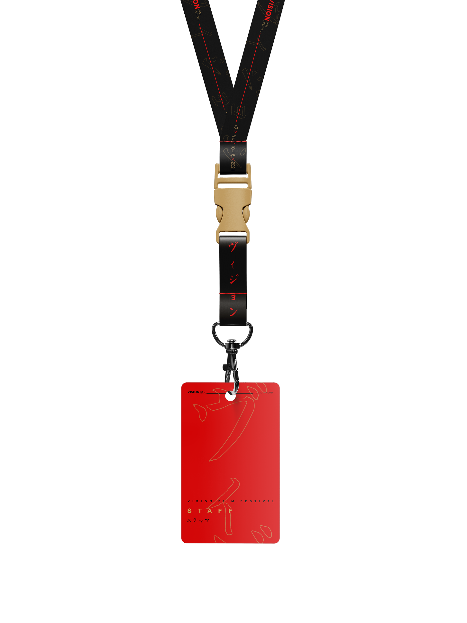
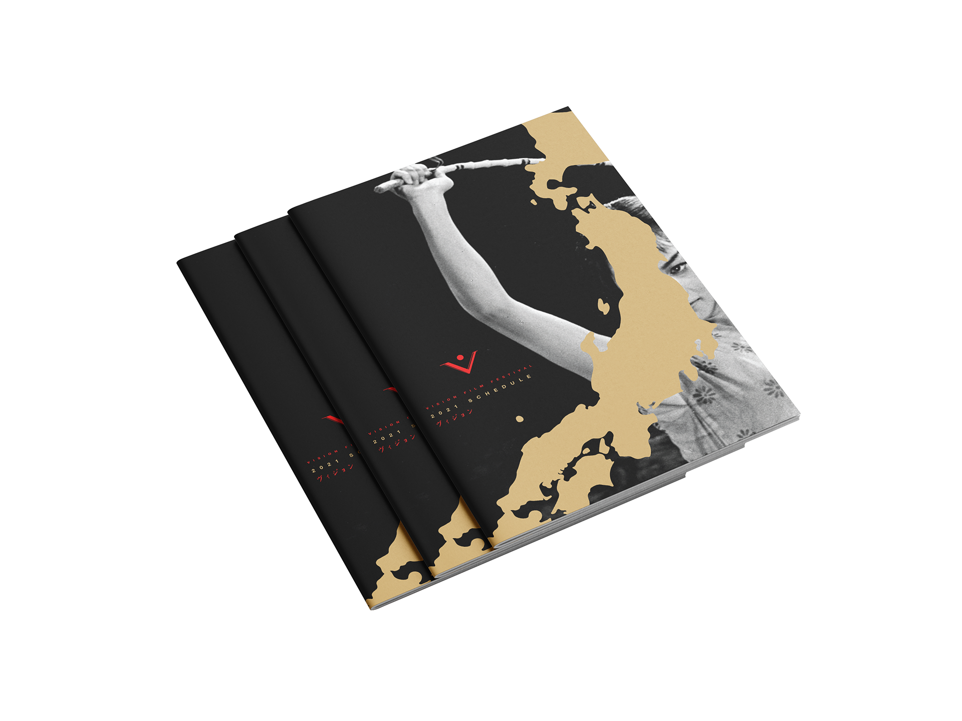
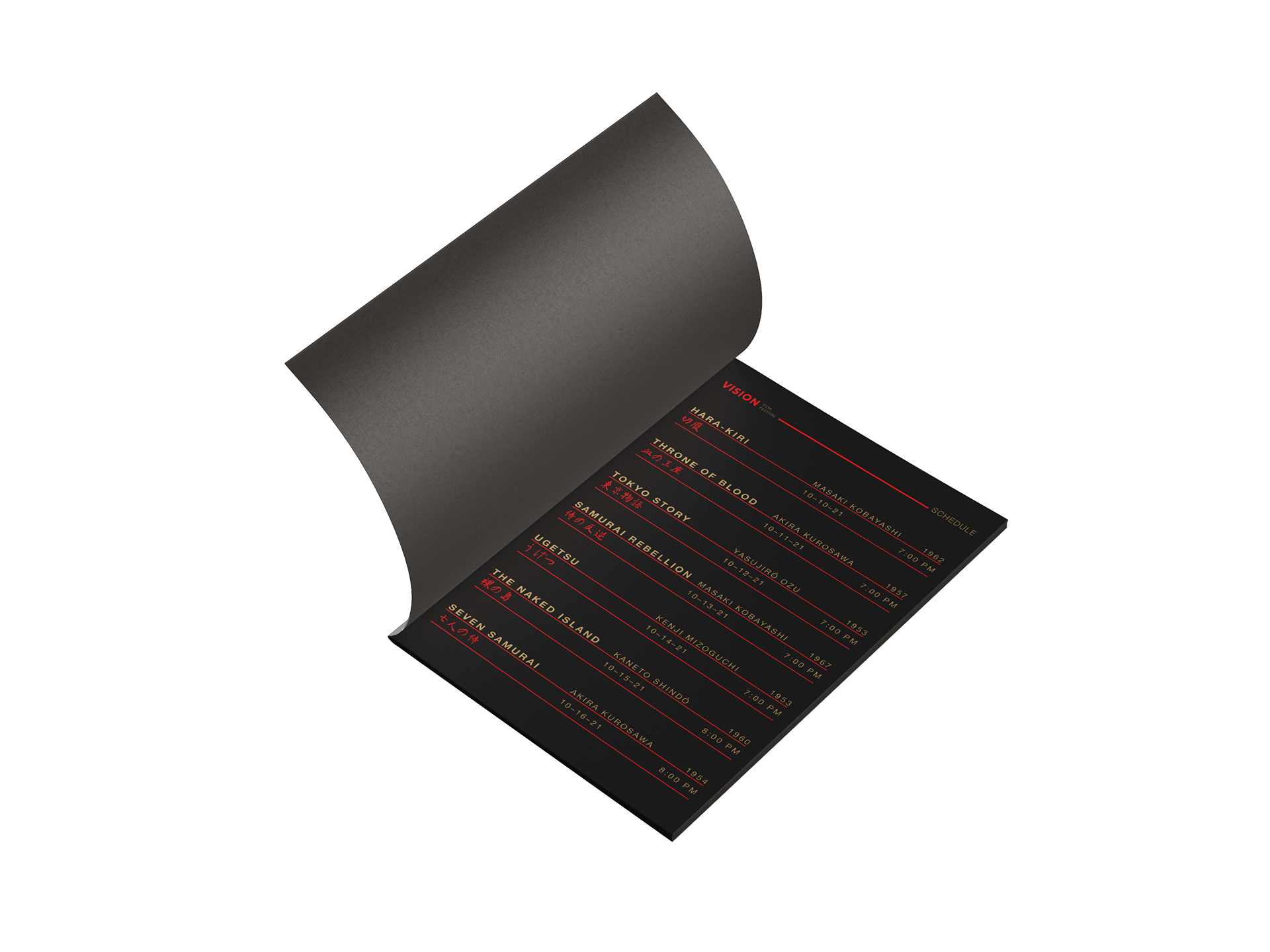
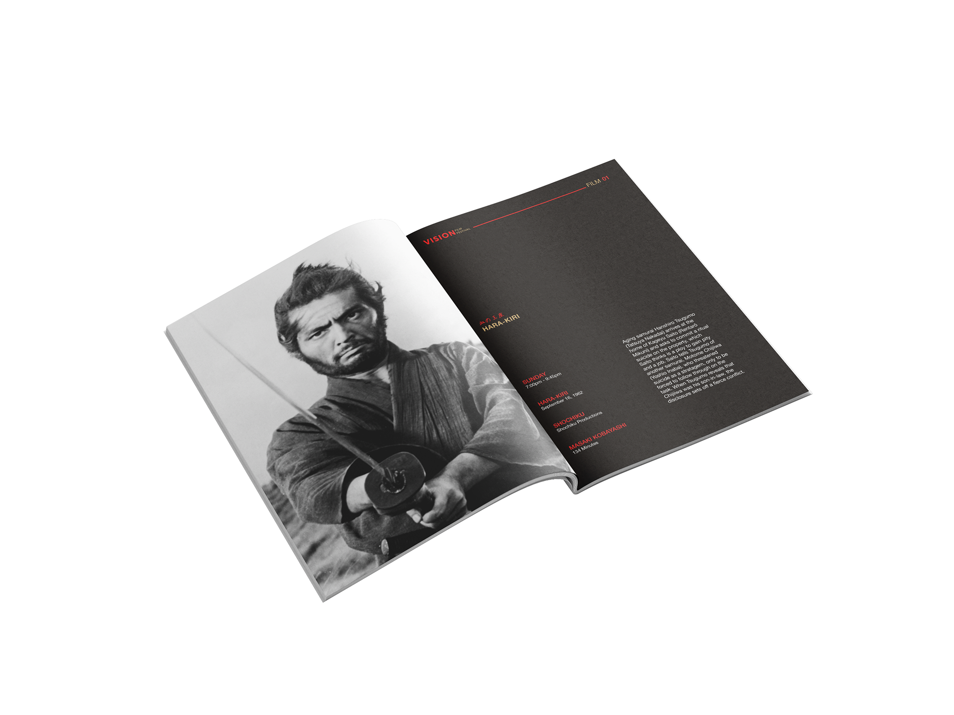
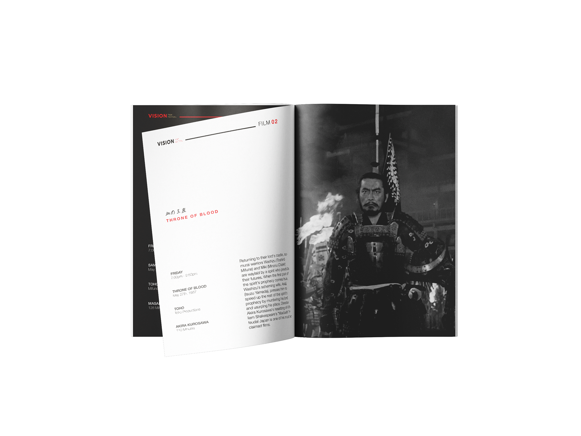
My design choices for this project were based on research of directors like Akira Kurosawa, Masaki Kobayashi, & Kenji Mizoguchi and how they framed each shot. I personally watched about 3-4 films to gain an understanding of how they framed shots and how they created syntax within a scene and infused these practices within the design. The style of the project was taken from a minimalist style of design with an emphasis on the filmmakers themselves and the artwork they created. I used Rig Shaded typeface and some handwritten kanji to create some assets that help bring some Japanese culture into the design. The kanji was used for posters, tote bags, banners, wristbands, etc.